I spent some time simplifying the website. I've always been attracted to simple, "clean" design in websites. When done well the solution to the problem the web site solves is clear and engaging to the site's users. This quote from Steve Jobs captures the challenges and pay off of simplifying:
Simple can be harder than complex: You have to work hard to get your thinking clean to make it simple. But it’s worth it in the end because once you get there, you can move mountains.
Steve Jobs
There were two main thrusts of my latest changes:
- Reducing the number of colors so they each have consistent meaning
- "Guiding" DIY courses construction to create similar courses
I'm using a theme with some built in colors and at first I didn't customize it much. So I had blue labels for a course's skills and the number of each type of course. To my eye, using a different color implied they were clickable elements. I was also using light blue for clickable links. I think that might have been confusing to some users.
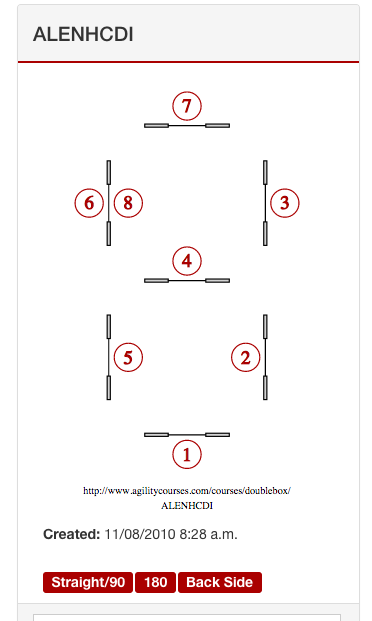
I'd chosen a dark red for all my accents and decided to use it for non-interactive labels; thereby reducing the labels' prominence. At the same time I regenerated all 10,000+ course images so the red sequence numbers also match the dark red.
So here's the color coordinated view of a course:

There is still a lot more to do but that change felt like a step in the right direction.
The DIY Course feature let users start their sequence at any obstacle/side. But since the obstacle layouts are basically symmetric this allowed multiple sequences to be created that were rotated versions of one another.
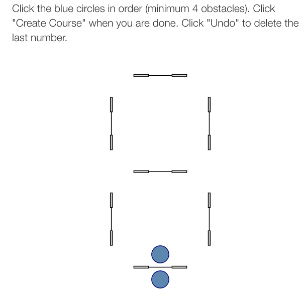
To solve this I changed the DIY page to only allow the bottom jump to be used to start a sequence. This should result in only creating truly unique sequences. If a DIY user creates a duplicate sequence they will just be given the already existing sequence.
Here's the new starting view for the Double Box:

In keeping with blue as my action/link color, the clickable circles are blue! I also added a slight fade in/ fade out as the circles become clickable; it is less jarring than having them immediately pop into view.
2015-Feb-15 Update
After I regenerated all the course images I noticed the wrong font was being used so I regenerated them all again with Google's Carlito font.