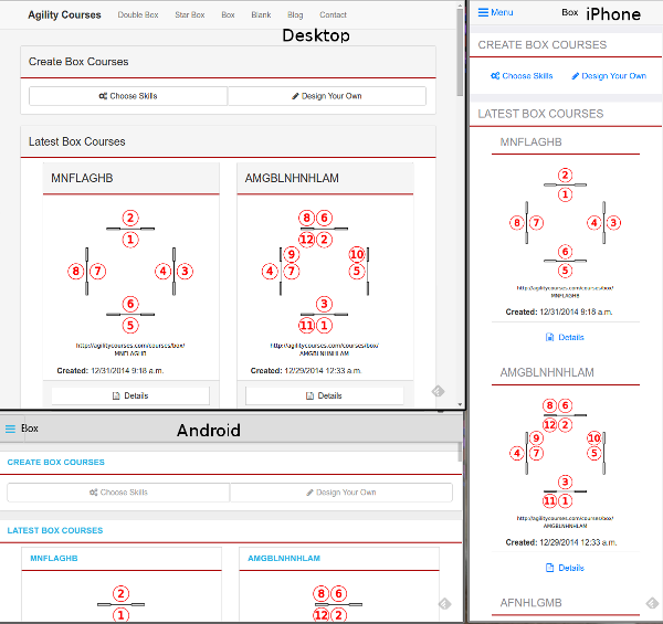
Long time users of agilitycourses.com will notice the site has changed completely! It is now uses a Responsive Web Design. The screen layout will rearrange itself for small screens on phones all the way up to large monitor desktop screens. The layout uses a framework called Bootcards to provide a card based design like you might see on sites like Pinterest, Google+, and Twitter. For the web developers among you here is a good article describing the card design trend. The nice thing about cards is how they can be re-arranged for different screen sizes and layouts.
Consequently, there is no longer a separate site for mobile (m.agilitycourses.com); any saved links to there will now send you to the same page on www.agilitycourses.com.
I've launched this redesign of the website as a first step toward adding new features. I have a huge list of features I'm planning but was held back by the thought that I'd be implementing them twice; once for the desktop site and again for the mobile site. Since agilitycourses.com is a labor of love, that I work on in my spare time, I just couldn't face that. So I spent the Christmas/New Years holiday weeks making a lot of technical changes:
- Rewrote the user interface to using Bootcards to provide a single software base that responsively changes to each user's device/screen size.
- Customized the printed style sheets so the pages print nicely; if you print the latest courses or similar courses pages you'll get two courses per page for easy use on the practice field!
- Moved from the agilitynerd.com server to it's own web server. I'm looking forward to supporting much, much more traffic and keeping the performance fast!
- Now running on the latest Ubuntu LTS OS.
- Migrated the database of 20,000 records from MySQL to Postgres.
- Migrated the application server software from Django 1.4 to Django 1.7.
- Upgraded many dependent software applications - including this blogging application
- Tons of testing on iPhone, iPad, Windows Phone, Android Phone, Android Tablet, Chrome, Safari, IE, and Firefox.
Here is a screen shot showing how the site changes it's look (thanks to Bootcards) to try to look like a native application on iPhone and Android phones:
Desktop, iPhone and Android Phone screens

I hope you find this site redesign works well for you on whatever device you are using! I hope to have some new features coming soon!